Maps & GIS

The Racial Anatomy of a Split Precinct

Gone are the days when redistricting consisted of markers and paper: now we know down to each and every block exactly how many white people over the age of 18 live there. In state like Virginia where white voters and minority voters are in total opposition, this matters.

I do still check on political blogs from the Commonwealth of Virginia, where I grew up. The eagle-eyed Not Larry Sabato blog was watching one particular precinct in Prince William County, Penn, which was split by Republican-controlled House of Delegates and Congressional redistrict, but left intact in the Democratic-controlled State Senate redistricting in 2011. What did this level of attention get them?

The bigger chunk of Penn, about 79% of it, was placed in the 1st Congressional (Rob Wittman) and 51st House of Delegates district (Rich Anderson), while the smaller chunk, about 21% of the precinct went with the 11th Congressional District (Gerry Connolly) 31st Delegate seat (Scott Lingamfelter). In the Congressional map, it was drawn to help all incumbents, so I knew the Connolly chunk was supposed to be more Democratic, while the Wittman area was supposed to be more Republican. In the House of Delegates districts, Republicans were trying to solidify Anderson who narrowly won his seat in 2009, so he got the more Republican area, while the Democratic area went into the much safer GOP seat of Lingamfelter that runs into other strongly GOP areas.

After reading all this, you must be wondering- how effective was this map? Here it is:

Rob Wittman/Rich Anderson portion of Penn precinct
Mitt Romney 1,028 (59.1%)
Barack Obama 710 (40.9%)

Gerry Connolly/Scott Lingamfelter portion of Penn precinct
Mitt Romney 107 (26.4%)
Barack Obama 298 (73.6%)

18.2% Romney margin of victory vs. a 47.2% Obama margin of victory

While political data is available down to the precinct level, the Census Bureau does count every single person by race block by block. In Penn, and other split precincts I saw in the 2011 redistricting cycle, the precincts were mostly split along obvious racial lines. All across Northern Virginia, whiter single-family homes were cleaved from less white townhouses and condos. While it’s certainly possible to link individual modeling scores block by block to attempt to calculate a precinct fragment’s lean, in a state as racially divided as Virginia it almost isn’t useful. Using this map of Penn precinct, I calculated the race population of each precinct fragment. Unsurprisingly, the variance in each fragment’s political performance matched up with race quite closely. This was one of many examples of redistricting deftly taking out minority blocks, not just precincts, and packing them together in super-blue districts.
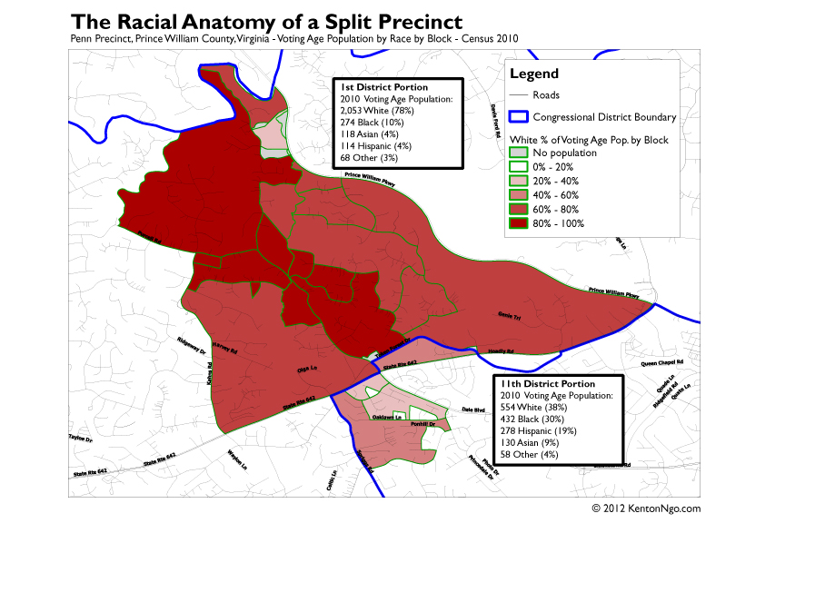

In the north portion given to the 1st Congressional District that gave Romney 59%, the voting age population is an astonishing 78% white. In the south portion given to the 11th Congressional District that gave Obama 74%, the voting age population is only 38%! You may notice that the block lines don’t match up quite exactly with the precinct lines–precincts are not required to follow Census geography–but the data is close enough to conclude that at least in Penn, Republicans knew block by block what they were doing.


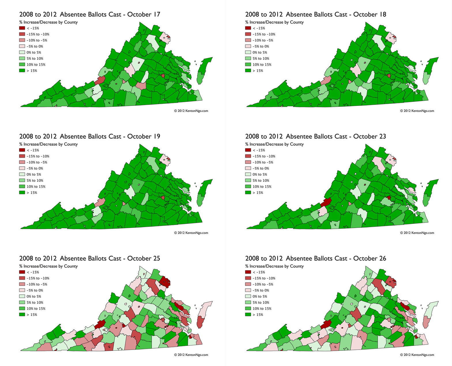
GIF GIS: Animating the Change in Virginia Absentee Ballots

Using data from the Virginia State Board of Elections, I have created this timeseries animation for the county-level change in mail and in-person absentee voting from 2008 and 2012. It is important to note in any analysis of Virginia early vote that it is not a no-excuse state, you must still give a reason even if interpretation of those reasons is fairly lenient: the most common are commuting and working more than 11 hours total on Election Day, travel outside the locality of residence, and going to school away from the locality. Thus, high-commute and high-income communities that have long commutes and many children in college have a higher early vote ceiling than other counties.

Now that animated GIFs are back in vogue, I have pondered uses for them besides amusing cat actions. I can see future uses for them in election GIS. Time-series data especially can be plotted in this relatively lightweight fashion when interactivity isn’t necessary. It also doesn’t require the programming chops a d3.js visualization.


North Carolina’s Amendment One

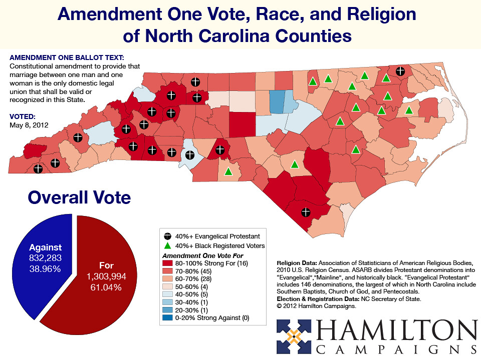
On May 8th, 2012, North Carolina voted on a constitutional amendment to ban any sort of same-sex union.


Redistricting Trounces Incumbents in Pennsylvania Primaries

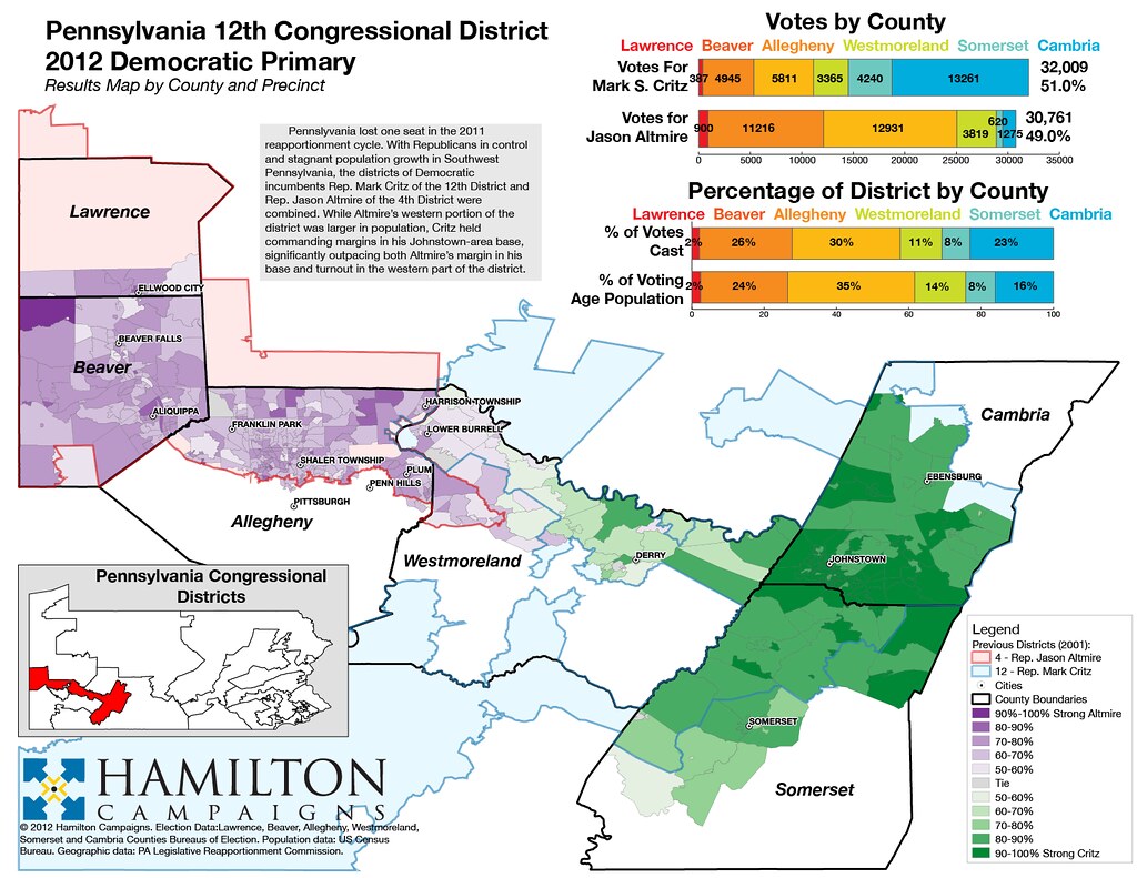
Pennsylvania’s stagnant population growth led to the Republican-controlled legislature drawing two Democrats out of existence. In Southwestern Pennsylvania’s 12th District, two Democratic incumbents were drawn together. Rep. Jason Altmire was given a substantially larger portion of the new district he fought for with Rep. Mark Critz, but Critz was able to win his home base by such an overwhelming margin that he overcame this geographic disadvantage. Strong geographic splits were also evident in the 17th District, where Rep. Tim Holden, a Blue Dog Democrat previously in a marginal seat, was given a Trojan horse of a blessing: a new district full of Democrats who were chomping at the bit to primary him from the left.

pa12

pa17


Orlando Mayoral Election

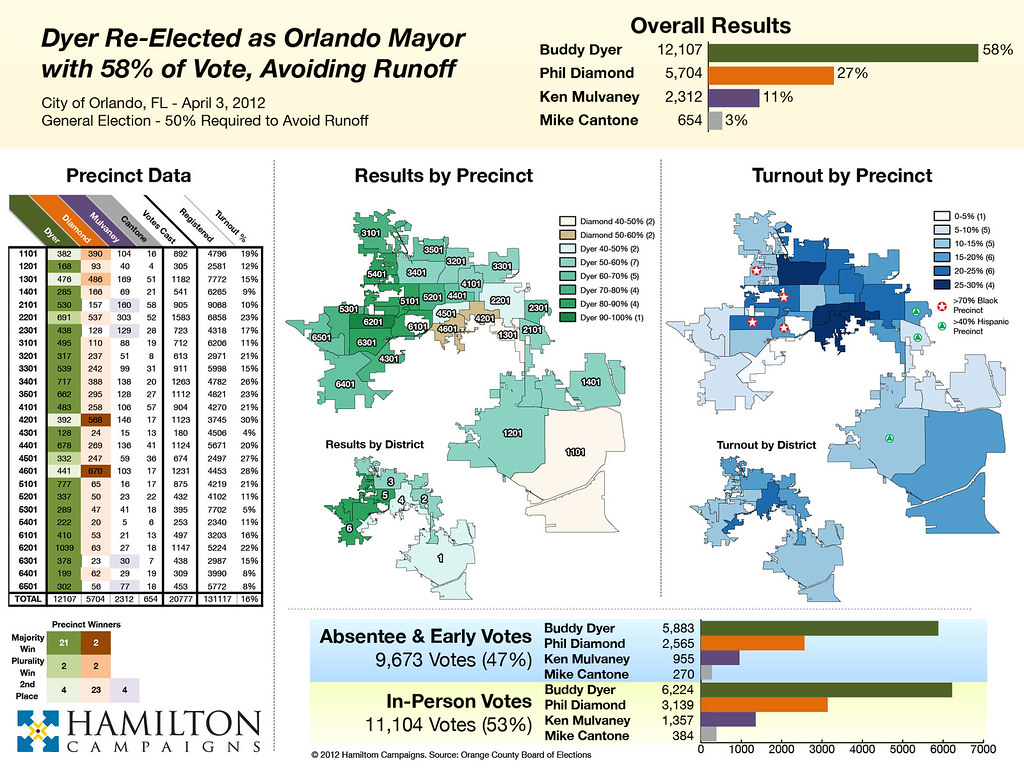
Orlando Mayor Buddy Dyer, a Democrat, won re-election on April 3. Dyer drew strong support in the minority areas of the City of Orlando, while his main opponent did better in high-turnout white areas. Dyer cleared the 50% required to avoid a runoff.

orlando-v08-large


County-Level Map: Republican Primary & Caucus Turnout Down 9%

2008-2012 Republican Primary Turnout v1
Enalrge map

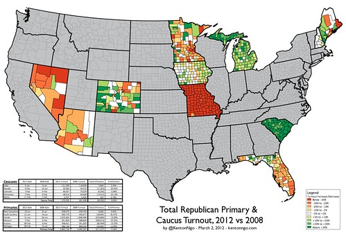
Total turnout of this year’s moody Republican voters in caucuses and primaries is down 9%, with a majority of contests showing a decrease. Incompetence and poor turnout have plagued caucus states especially, with especially anemic showings in Nevada and Minnesota. This year’s Missouri primary was made nonbinding, in contrast to 2008, leading to an astonishing 57% drop in participation.

Florida and Minnesota show total collapses in most of the state except for rural counties away from major metropolitan areas. The entire Atlantic coast of Florida from Jacksonville to Miami joined the Minneapolis-St. Paul area in shunning the contests. The base might be angry, but they’re not coming out to vote.

Going into tomorrow’s Washington caucuses and the Super Tuesday states, will we see a Republican electorate finally waking up to its nomination contest, or fatigue and disenchantment? This map might give Newt Gingrich a (lately rare) ray of hope: his home state of Georgia so far is surrounded by green.

On DailyKos