UPDATE! I have 3 24″x36″ prints left of the map below for sale for $39 each plus shipping. They’re full color, union printed, and ready to grace your wall. Use the secure PayPal link below to order.
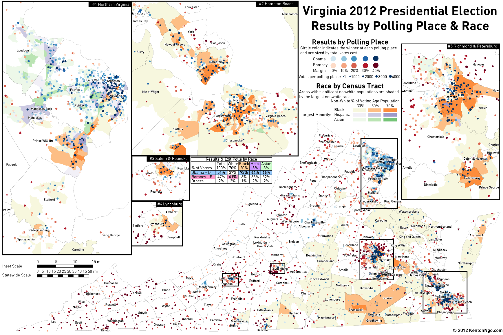
 It’s well-known by now that Barack Obama’s strong support among a growing set of people of color propelled him to victory over Mitt Romney’s white-dependent coalition. Few states have shown this more than Virginia, where exit polls show Obama won the state carrying only 37% of the white vote. I have prepared the map below which overlays polling place-level election results on top of Census non-white percentage.
Areas are shaded by their total non-white percentage and also whether those areas were more ▰ Black (orange), ▰ Hispanic (purple), or ▰ Asian (green). ● Blue dots showing Democratic precincts cluster in diverse areas, growing more intense as nonwhite population increases, while ● red dots showing Republican precincts correlate tightly to white areas.
Racial divisons are especially profound in Hampton Roads and Richmond, where racial politics are still largely a two-dimensional Black and White game. Notice city pairs such as black Petersburg and white Colonial Heights, which are separated by a river and are at polar opposites in politics. In Northern Virginia, Black voters are eclipsed in population by Hispanic and Asian voters, which voted heavily Democratic, but not at the near-unanimous level of Black voters. In the western part of the state, where voters are often overwhelmingly white, red dots are dominant outside of college towns. Outside of well-discussed urban cores were rural areas in Southside Virginia that have a significant Black population.
This map was heavily inspired by Bill Rankin’s dot-density maps of regional race and the New York Times’ size-dot precinct map of New York City. Trying to show race and political data at the same time can be a difficult task, but I find that the pointillist view of using individual dots for precincts on top of a colored race layer is a good way to show its complexity.
The full size version is after the jump.

Order a 24″x36″ print of the above map for $39 plus shipping…use the link below!

