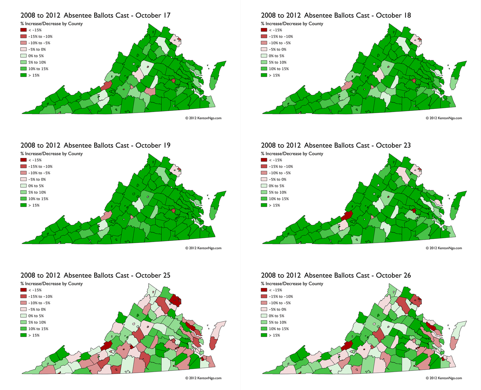
Using data from the Virginia State Board of Elections, I have created this timeseries animation for the county-level change in mail and in-person absentee voting from 2008 and 2012. It is important to note in any analysis of Virginia early vote that it is not a no-excuse state, you must still give a reason even if interpretation of those reasons is fairly lenient: the most common are commuting and working more than 11 hours total on Election Day, travel outside the locality of residence, and going to school away from the locality. Thus, high-commute and high-income communities that have long commutes and many children in college have a higher early vote ceiling than other counties.
Now that animated GIFs are back in vogue, I have pondered uses for them besides amusing cat actions. I can see future uses for them in election GIS. Time-series data especially can be plotted in this relatively lightweight fashion when interactivity isn’t necessary. It also doesn’t require the programming chops a d3.js visualization.


